

Version 4.0
Since Aug 27, 2026, in progress
Every metric the app shows is defined in the glossary: Glossary
A whole redesign
Pages had drifted apart: different margins, different headers, different tables, six charts inventing their own greys. Version 4 puts the app back on one shape, so what you learn on one page holds on the next. Every gradient, halo and glow went with them. A card is delimited by its border, and the only animations left do a job: something is loading, something is pending, a block just arrived.
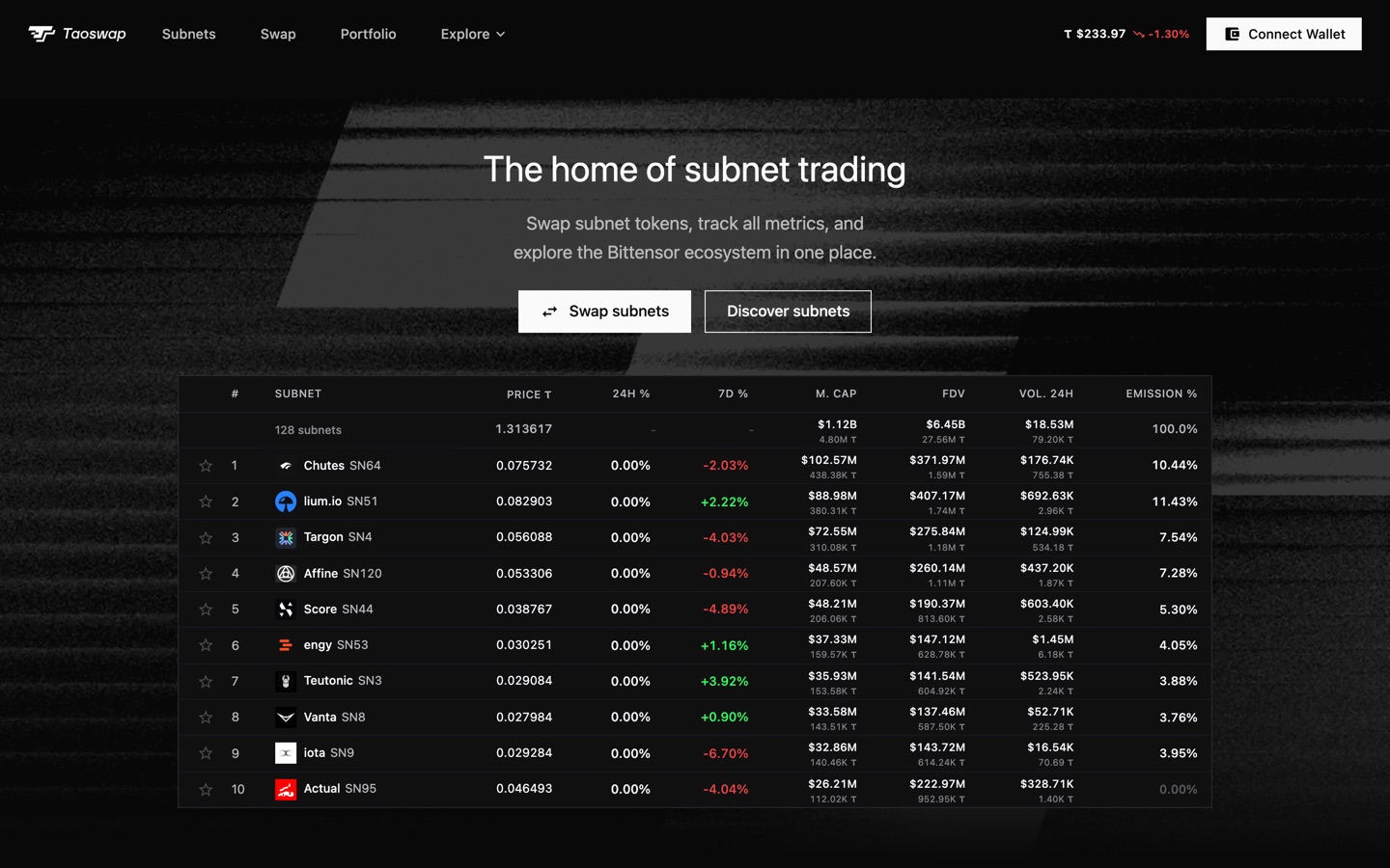
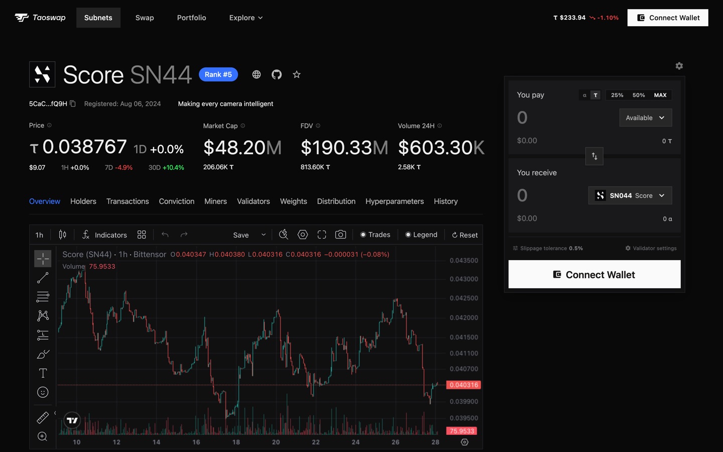
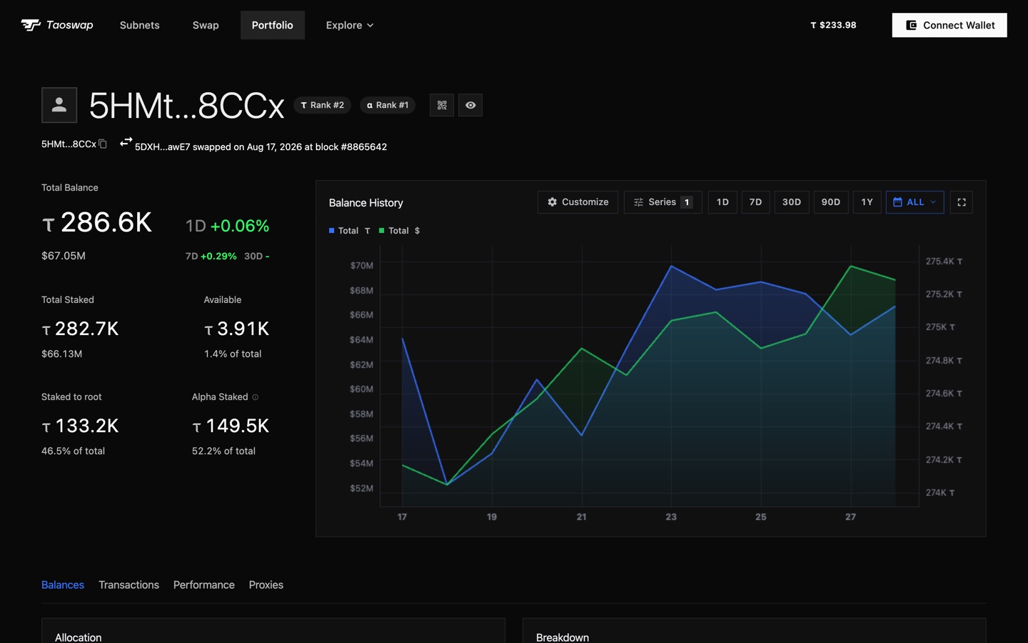
- Sections, not tabsA detail page stacks everything it has and marks what you are reading, so nothing is hidden behind a tab and every part has a link.
- Titles that name their subjectThe list pages say what they list, and a section title carries its own count.
- Basket composition you can read at a glanceWhat a root validator's basket holds is drawn as a grid: one row per basket, one column per subnet, the share in each cell or a heat ramp, with the subnet logos along the top.
- Several wallets, one curveWatch a set of addresses and the balance history draws the lot as a single portfolio.
- It opens fasterThe splash screen is lighter, and the waits are shorter throughout, from the first paint to every page after it.